“Big data.” It’s in the air. For instance, IBM claims that “[e]very day, we create 2.5 quintillion bytes of data—so much that 90% of the data in the world today has been created in the last two years alone.” In 2008, Nature ran an interesting special on big data. And in the humanities as of late, there has been a slew of discussions about the variety, velocity, and volume of information. Consider the recent “Big Data” event at McGill University (organized by Stéfan Sinclair and Matthew Milner), the Stanford Literary Lab’s pamphlets series, and the cultural analytics work being done in the Software Studies Lab at UCSD and Calit2.
So when the Digital Rhetoric Collaborative asked me to write about what digital rhetoric means to me, I couldn’t help but go to data, and lots of it. Not because big data is my specialty. Far from it. In most cases, I am a small-scale thinker, and I’m pretty sure that—until now—the word “petabyte” has never appeared in my writing.
I went to data, then, because I think it poses curious questions, questions largely anchored in an emerging mode of abstract expression. You can call it a genre, if you prefer, consisting of what Franco Moretti scoops under the tripartite umbrella, Graphs, Maps, Trees. Johanna Drucker refers to it more generally as graphical display. Tool-builders (e.g., of Gephi) usually call it visualization. Whatever the preferred nomenclature, this emerging mode of abstract expression allows people to say a lot in a small amount of space, make claims about cultural forces, graph social relations, assess patterns, and articulate landscapes and topographies.
I’m inclined to say this abstract mode reaches its epitome with the infographic. Or as Visual.ly puts it: “VISUALIZATIONS [AKA INFOGRAPHICS].”
http://youtube.com/watch?v=sCmO8YKzv9U&
From this video, we can draw a pretty strong taxonomy of infographics as expressions. They combine story, data, and design. They correspond with an observed cultural phenomenon, namely an “age of big data” identified by companies such as IBM. They also deal directly with the challenges of volume and scale, and they flexibly respond to the fact that data can be accessed and presented in a number of ways. They foster community formations, or at least there is potential for communities to organize around them. They are described as immersive and experiential—alluring, even. They are motivated by the “seeing is believing” mantra. They are compact, and they leverage information aesthetics. But perhaps most importantly: with a computer and internet access, anyone can make them; you can easily lie with them; and they translate data into a central ingredient of the composition process.
With a Computer and Internet Access, Anyone Can Make Them
In less than a minute, I made this infographic using Visual.ly, based on a Twitter hashtag for the 2012 Digital Humanities Summer Institute.
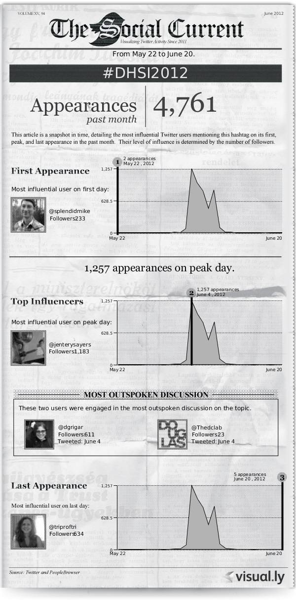
Ok, I confess to using Twitter a bit, especially during conferences and institutes. That bit aside, the obvious but crucial aspect of this image is that I didn’t need to know how APIs work, or how to make a graph, or how to model data, or how to design information. Visual.ly does all of the things. And now data—especially social network data—has joined the embed, repurposing, and mashup cultures historically associated (in terms of the web, at least) with video and audio. By providing handy templates for data expression, businesses like Visual.ly facilitate this cobbling process. They make it easier to make arguments via “insert-your-data-here” abstractions.
Echoing Kristen Arola’s recent work on design, we might say that infographics are, first and foremost, about efficiency (rather than democracy or shared knowledge) (2010: 12). For scholars of digital rhetoric, this observation raises questions about the extent to which people should be aware of the technical and cultural particulars of what they are composing, including from where data is harvested, how it is being shaped, and through what approaches, platforms, languages, and tools.
None of these comments is intended to critique the niftiness of Visual.ly, which is a fun (and addictive) space for discovering and generating infographics. And none of them is intended to venture into the inevitable: the argument that, all the way down to the last instance, people should know exactly how what they use, consume, or circulate became what it is. On the contrary, the fact that anyone with a computer and internet access can make an infographic suggests that the practice of digital rhetoric now involves a complex network of information, components, and contributors, which necessarily exceed our individual knowledge.
The thing about networks is they are at once friendly and enigmatic. They invite us to make persuasive things using data beyond the scope of our perceptions.
You Can Easily Lie with Them
My #dhsi2012 infographic is not necessarily a falsity; it’s a contrivance produced through someone else’s competencies (e.g., in design, data modeling, and visualization). That’s why I suggest you can easily lie with infographics. They afford the opportunity to mobilize evidence unfamiliar or unknown to us. We see similar opportunities with tools such as the Google Books Ngram Viewer, through which audiences can interpret books they’ve never read.
From the perspective of digital rhetoric, this dimension of digital inquiry is unique because it sparks playful or non-empirical modes of investigation. That is, neither data nor its visualization necessarily acts as “proof.” Scholars of things digital can imagine, for instance, how data-driven expressions can be used to author fiction (e.g., J.R. Carpenter’s in absentia), visualize affect (e.g., the work of Christian Nold), conjecture in real-time (e.g., Panopticon), or openly declare that the people feel fine (e.g., the work of Jonathan Harris and Sep Kamvar).
When such expressions are not exactly interested in depicting actuality as it was, or articulating an isomorphic relationship between representation and reality, then approaches to digital rhetoric are prompted to investigate the situatedness, contingencies, and construction of infographics and other visualizations. How does data allow us to speculate? How might a graph spark a novel line of inquiry? What happens if visual literacy is steeped not in designing authoritative or true representations but rather in persuasive and engaging ones? What if, like the word processor, the abstract expression becomes a platform for (among other things) creative endeavours?
Framed this way, abstract expressions can be demystified (e.g., by showing how they are ideological or misleading) as well as re-imagined as vehicles for—piggybacking on Bruce Sterling’s recent work—designing fictions and counterfactuals. Perhaps Kari Kraus gives us the best framework for this approach, with her use of “conjectural criticism,” through which digital data (or signs) can be manipulated “with the goal of either recovering a prior configuration or predicting a future or potential one” (2009: para 16). The 2.5 quintillion bytes of data generated by networks could thus become fodder for graphs, maps, and trees that ask: “What if . . . ?”
The thing about networks is their data can be used to produce multiple, contradictory arguments. While they are highly ideological, they are also highly ambivalent.
They Translate Data into a Central Ingredient of the Composition Process
At the current moment, digital rhetoric is meaningful to me because data is routinely entering into the most banal and everyday composition processes. Considering things like infographics on the fly, scholars must now ask: (1) What is the rhetoric of big data? For whom is data useful, under what assumptions, for what audiences, and to what effects? (2) How can we approach big data rhetorically? In a moment when data is visualized in real-time (e.g., Google Real-Time Analytics), how do we talk about process and persuasion? How do we reflect? How do we situate or orient ourselves? (3) How does big data argue? How are the logics of quantification combined with the aesthetics of information design and the strategies of narrative? When do people refer to visualizations as “beautiful” and why? (4) What are the rhetorical strategies of abstract expressions? To what extent do we need to be familiar with how new media are actually made, stored, and circulated? Are visualizations about “wrangling” information, or about something else entirely?
Recently, in Arts and Humanities in Higher Education, Alan Liu asked: “What kinds of humanistic phenomena appear only at scale?” (2012: 21). This is a compelling question, and there’s no reason why—together—scholars of digital rhetoric cannot contribute to its answers.
The thing about networks is that they can easily individuate us through data and quantification. They can also foster collectives and clusters of like-minded people, much like this Digital Rhetoric Collaborative, which is only getting started.
Thanks for taking the time.
4 Comments
Pingback: The Thing about Networks, or Big Data Rhetoric – Jentery Sayers
Pingback: Defining Digital Rhetoric with 20-20 Hindsight — Digital Rhetoric Collaborative
Thanks Jentery. I found this really interesting and appreciate the questions raised, especially: “What happens if visual literacy is steeped not in designing authoritative or true representations but rather in persuasive and engaging ones?”
I am always intrigued by your work even as my own interests in the topics your write and teach about diverges further I always find myself with lots to think about after I find something that you have done. As I have been considering how educational happens and affects social change, I think this question of big data and how educators guide students interaction with the growing information at their fingertips is central — particularly navigating tensions between the “authoritative and true” (do those go together?) and the “persuasive and engaging.” I would love to hear / see more of your thoughts about where systems of higher education are headed and whether you believe they will remain in the same authority as present.
Thanks again. I’ll share the Mark Twain quote on my desk now…
~Matt
“The secret of getting ahead is getting started. The secret of getting started is breaking your complex overwhelming tasks into small manageable tasks, and then starting on the first one.”
~Mark Twain
Pingback: Readings for January 25 – Big Data and the Rhetoric of Information