
As a designer, I have previously carried out a range of projects that have involved some sort of data visualization. However, most often the clients I have been working with have given me relatively small datasets or information that was more or less ready for visualization. Consequently, I never got to explore the data myself.
Recently, however, I have had the opportunity to engage with a large dataset, as part of a practice-based research project. The data I have been working with comes from a large survey that asked 30.000 Norwegians about their perceptions of public services in Norway, the welfare state and democracy, and living in different parts of Norway.
Being a design researcher, I wanted to investigate how visualization might be used for exploring, understanding and analyzing this data. Here, I will share my experiences from two of the approaches I have been using: gigamapping and programming.
Gigamapping the survey
One of the challenges of approaching a large dataset produced by someone else is to understand the context in which it was created. How was the data gathered? What can the data tell us, and more importantly, what are the limitations? Are there any specific issues that are important to be aware of when analyzing and presenting the data?
In order to get a better understanding of the data, I had a meeting with the people that were responsible for the survey (a Norwegian governmental agency called Difi). While discussing the survey, I made notes and sketches on a large piece of paper laid out on the table, which served as a medium for documentation as well as a shared platform for discussion during the meeting. The resulting sketch was messy and kind of ugly (as expected!), but served its purpose well during the meeting.
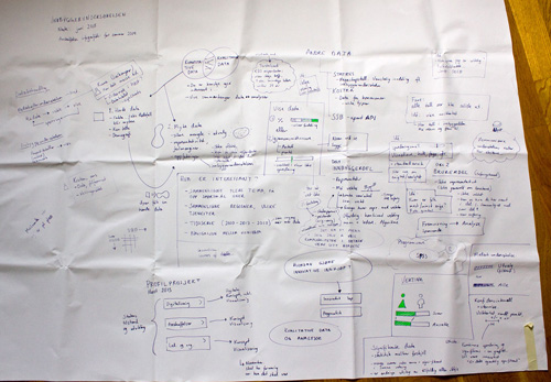
Later, I made a digital version of the map using Adobe Illustrator, where I rearranged everything and added some more information. The result is a visual overview that maps out different aspects of the survey and the data, and also serves as a medium for discussing the project with Difi and others.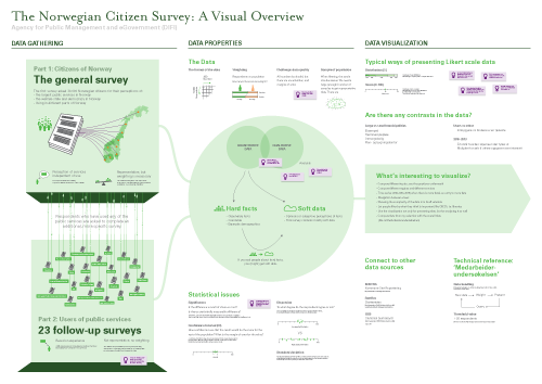
This technique, which has been called gigamapping by Birger Sevaldson, has in recent years gained a lot of popularity, especially in the design community in Norway. The basic idea behind gigamapping is that visualization provides an efficient tool for dealing with complexity, allowing the participants to get a common platform for understanding a system or a topic, and allow connections to be made between seemingly separated pieces of information across multiple layers and scales.
For me, the process of making the map was probably as important as the resulting map itself, as this forced me to understand, clarify and reflect on the information, and look deeper into areas that I didn’t know much about. This seems to resonate with Brenta Blevins’ and Virginia Kuhn’s recent blogposts, pointing to how visualization can be used for analysis and discovery as well as representation.
While creating the map I found it useful to organized the content into three sections: the first section describes how the data has been gathered through several surveys, the second section describing important properties of the data, and the last one describes Difi’s ideas and needs for data visualization. In addition I made a map that listed all the topics and questions of the survey. Finally, I printed the two maps on large pieces of paper, and put them on the wall in my office.
The maps remind me of all the aspects of the survey, and I have continued to add information and connections by scribbling directly onto the maps on the wall. Consequently, I see these visualizations more as a tools for ‘sensemaking’ than finished infographics to be presented and easily understood by an audience. Still, it has been useful to show the map in presentations, and by using Prezi I have been able to literally zoom into specific areas of interest. In addition, putting the maps on the wall made the project visible to visitors and colleagues, and has thereby sparked some interesting discussions.
One of the challenges with gigamapping is to find the balance between complexity/messiness and simplicity/clarity, between visualization as a tool for analysis and visualization as a medium for communication. Sometimes it is necessary to embrace complexity, other times it seems more important to simplify in order to find the essence of something as well as to communicate clearly to an audience. Even though I use gigamapping primarily as a tool for sensemaking, I find it useful to draw on principles from graphic design (such visual hierarchy, white space and spatial grouping) to make it as “readable” as possible for others.
10,039,380 data points
After the gigmapping exercise, it was time to work with the data itself. The data comes in a large spreadsheet format in which each respondent’s answers are located in a row, and each column represents an answer to a question (or data about the respondent). For just part 1 of the survey there were 23,790 rows and 422 columns, which resulted in a total of 10,039,380 cells! Where to begin?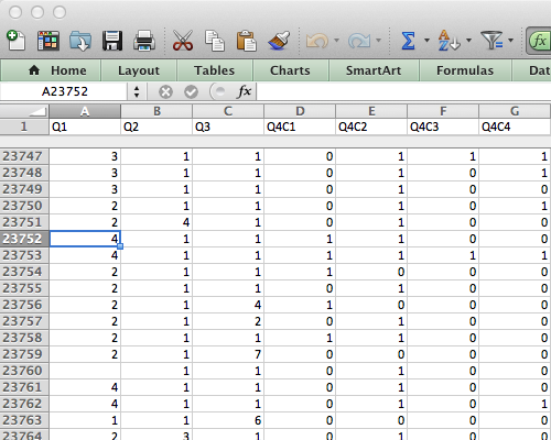
Categorical data overview
At this point I was looking for a way to get an overview of all the data. After trying a range of different applications, I found a script written by Moritz Stefaner called dbcounter. The script is made for Nodebox, a free Mac application for creating 2D visuals using the Python scripting language. The dbcounter script quickly makes a visual overview of large sets of categorical data (like survey data). I had to tweak the script a bit, and was therefore happy that I had just learned some Python programming at CodeAcademy. I saved the resulting illustration as a PDF, opened the PDF in Illustrator and adjusted text, layout and colors.
In the visualization, each row shows the distribution of the responses for each question in the survey. Next to the graphic I put all the questions, so that I can zoom in and see the distribution and the corresponding question. The image below shows only a small part of the full visualization.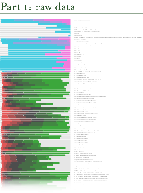
The responses that show a red to green gradient represent likert scale questions (ranging from ‘disagree’ to ‘agree’, or from ‘very bad’ to ‘very good’). The pink-to-cyan gradients represent all other kinds of questions and variables, in which the categories are more arbitrary. Consequently, it is necessary to know the questions (and possible answers) in order to fully understand the visualization. This would not make much sense to present for a general audience, but it works well as a starting point for discovery and analysis. The resulting visualization allowed me to see the distribution for all the questions at once, and made it easier to discover interesting variables in the data set, and thereby start asking questions.
dbcounter demonstrates how a simple script can be used to create a visualization that otherwise would take hours to produce manually. Even though some programming skills were necessary, this exemplifies how you might get a lot for free by finding a script or code snippet that is close to what you need, and make small adjustments to it.
Visualization as sensemaking
The two examples I have described have one thing in common: they focus on visualization as a tool for understanding and working with data. I strongly believe that visualization is not only useful for presenting information to an audience, but also as a tool for thinking, analyzing and documenting information, and for facilitating collaborative processes. In other words, making sense of all the data.
While the dbcounter script is specifically useful for visualizing categorical data such as survey data, the gigamapping technique can be useful in a range of different projects that somehow deal with complex information, be it qualitative or quantitative.
Looking back at these and the other visualization experiments I have carried out so far for making sense of the data, I think the most important lesson has been to experience how many different ways it is possible to approach a dataset through visualization. There simply is not one type of visualization that can show everything; different types of visualizations provide different types of insights.
This also points to the importance of data visualization in general: by visualizing our data in different ways, we see it through different lenses, and thereby learn something new about the data itself.