This is the second of two posts detailing digital advocacy projects created by master’s students in a Digital Rhetoric & Literacy course in Fall 2018. The course, described in more detail in Part I, ended with a final project that invited students to, among other options, use what they had learned about multimodal design to make something digital that does work in the world for a particular audience. Three students used the assignment as an opportunity to undertake digital advocacy projects. The first, discussed in Part I, is Casey J. Marshall’s advocacy for using Universal Design principles in online writing classes. The next second and third projects are discussed here.
Designing More Informative Scholarly Search Results: Malia’s Project

Traditionally, academic disciplines are presented as separate entities with only a few places of interaction across borders. In my prototype website, The Warren, I employ design advocacy (Jiang & Tham, 2019) to change the way that we see and interact with scholarly search results.
In contrast with database search results that provide lists of publications that can be narrowed by discipline, The Warren provides an alternative visualization that displays connections among scholars, and so disciplines. Its title portrays this mission: scholars, or “rabbits,” belonging to different academic fields, or “burrows,” are encouraged to break down the walls separating them from other burrows. This creates one large “warren” that is open to any rabbit. This governing metaphor and the accompanying design are intended to help democratize research practices for users—especially users who are new to a broad field like rhetoric & composition.
To do this, The Warren generates a relationship graph that makes connections among scholars obvious.
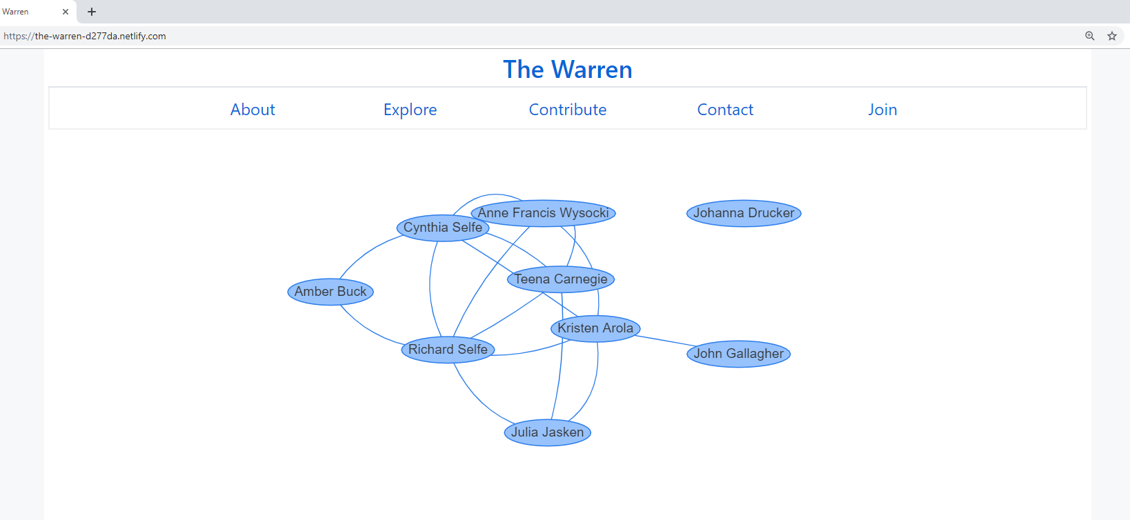
Inspired by Wysocki & Jasken (2004), I wanted this project to consider “what behaviors and actions are encouraged—and not—by all that is on the screen and by the actions and decisions that have shaped what is on the screen” (p. 45). The Warren resists lists and the ranking and separation of resources, responding to the very valid concerns of scholars like Noble (2018). I hope that this reimagining of scholarly search results will facilitate exploration and encounters with scholarship that might otherwise be overlooked or difficult to find. By rethinking the design of search results, the relationship graph helps users follow connections and encounter scholars whose work they may not have come across before.
The graph is designed to spawn a random arrangement each time it loads. Names can be pulled across the screen for further exploration. Users can begin with one name and move the graph around to trace connections to new scholars. A name can then be selected to display that scholar’s biographical information a list of their published works.
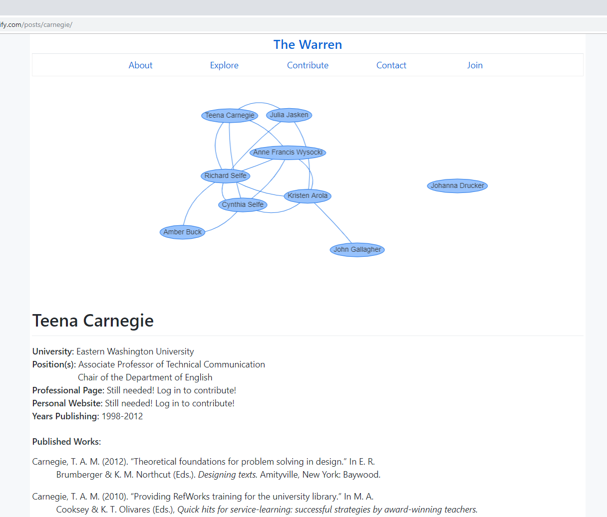
For now, this is a prototype meant to explore the possibilities of such a website. It could be developed more professionally in the future, becoming a crowdsourced database where graduate students and faculty from different disciplines conduct research without the artificial barriers created by filtering traditional search results by field or hierarchy and without extensive prior knowledge. Like Kairos’ ScholarNames project and the Writing Studies Tree, The Warren could serve to welcome those new to rhetoric & composition and situate scholars in and related to the field.
Advocating for Housing Equality: Rain’s Project
My project started about two years before Digital Rhetoric & Literacy, when I got into Marxist spatial theory and then city planning, development history, inclusive zoning, density practices, affordable housing regulation, and regulatory barriers to homeownership. I started paying attention to local city planning meetings and had serious talks about housing with my lawyer friend Gabriel Pitassi. Through these talks, we decided to launch a nonprofit to advocate on behalf of renters and those locked out of communities because of regional regulatory barriers, economic roadblocks, and gatekeeping practices.
So it made sense to use the final project in Dr. Prins’ class to support our organization, InlandYIMBY (“yes in my backyard,” an affirmative inversion of the NIMBY phenomenon). My project includes planning InlandYIMBY’s website, building our social media profiles (Facebook, Twitter, Instagram, etc.), and writing a proposal for how we will use digital platforms to build support for the organization.
These plans are modeled on the digital profiles of similar nonprofits (like YIMBY Action in the Bay Area) and best practices in public advocacy. Although social media offers limited control over visual design, its potential reach makes it seem obvious, even mandatory, for a social advocacy organization to use. In designing our social media guidelines, I strove to establish healthy, nontoxic spaces for working-class, primarily younger, people to collaborate on housing issues while fostering mutual respect, egalitarianism, and inclusivity.
As I developed our mission and vision statements and social media profiles, I was aware of the delicate choreography of credibly teaching people, responding quickly to community members’ questions, and moderating discussions on social media—all while encouraging democratic participation and grassroots leadership. To foster this, our organization’s digital presence centers those we’re working to help, including women who are forced to weigh living in abusive homes against a very reasonable fear of homelessness, municipal workers who cannot afford to live in the cities they serve on a daily basis, and people of color whose children are locked into inadequate school districts.
With this established, I started making stuff. I wanted people to feel good about being involved with our organization over time as we confront frustrating political processes, public ignorance of housing facts, and overt discrimination. So our social media plan includes positive news and jokes along with educational content that is often heavier. Our logo, which I designed with Malia Ruehl, is also purposefully positive:
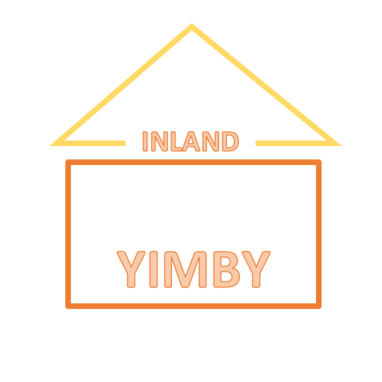
It uses visual logics (Kress, 2003) to evoke the whole of our mission: The colors are “sunny” (like “happy” and like “Southern California,” where we’re located). The design depicts a house, which signals that the organization is aligned with housing issues. The word “Inland” helps to anchor this regional sense, and the triangle being offset from the rectangle also recalls the topography of the region (a valley with mountains at the northern end).
Although I have recently shelved my work with the organization while I’m living away from the Inland Empire, I am excited that the work has attracted attention and hope it will continue in the future.
Reflecting on Students’ Design Advocacy Projects

One of my unstated goals for this course was to denaturalize the digital devices and interfaces my students and I routinely interact with, so that we could subject them to critical analysis and consider how they might be otherwise. But as Casey, Malia, and Rain demonstrate, there are lots of features of our lives—the default structures and technologies of online writing classes at many universities, the disorienting work of building a mental map of the major scholars and research topics in a new field as a graduate student, the lack of affordable housing in the Inland Empire and many other places in the US—that are strange to those who negotiate these issues in their daily lives. Their projects leverage affordances of digital networks, platforms, and interfaces to advocate for social justice through design, to show us how the world might be otherwise.
References
Jiang, Jialei, & Jason Tham. (2019, February 5). Multimodal design and social advocacy: Charting future directions for design as an interdisciplinary engagement. Gayle Morris Sweetland Digital Rhetoric Collaborative. Retrieved March 20, 2019, from www.digitalrhetoriccollaborative.org/2019/02/05/multimodal-design-social-advocacy/
Kress, Gunther. (2003). Literacy in the new media age. New York: NY, Routledge.
Noble, Safiya Umoja. (2018). Algorithms of oppression: How search engines reinforce racism. New York, NY: New York University Press.
Wysocki, Anne Frances, & Julia I. Jasken. (2004). What should be an unforgettable face…. Computers and Composition 21(1), 29–48.
